Dublin makes room for cyclists and pedestrians
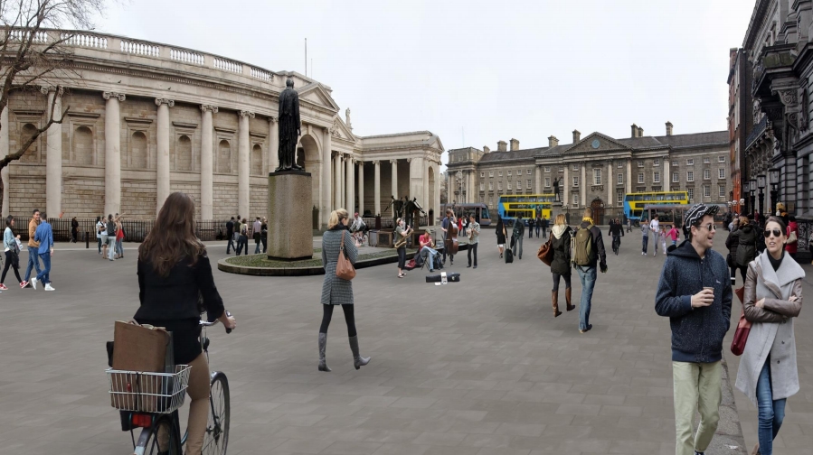
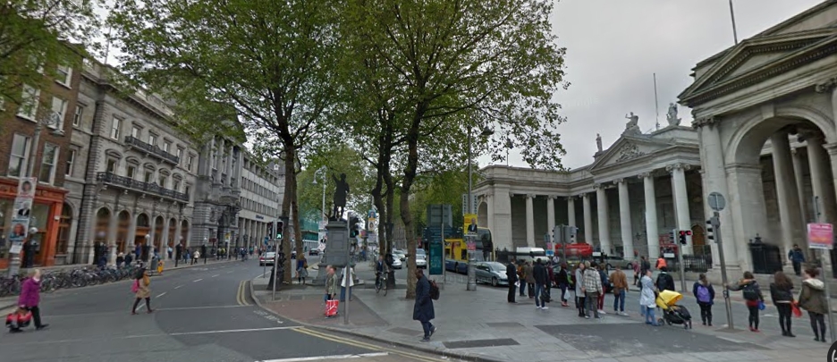
The city of Dublin is planning to make one of the main hubs in the inner city car, busses and taxis free. College Green, now hardly recognizable as a square, will be given back to the Dubliners, together with some surrounding streets. It will become the livable heart of Dublin, surrounded by Trinity College, the Bank of Ireland and gate to Dublin’s most important shopping street (Grafton Street). Dublin will be finally regarderd as one of courageous cities together with Brussels, Oslo and Madrid, which also are making important parts of their inner city car free.
Cyclists and pedestrians
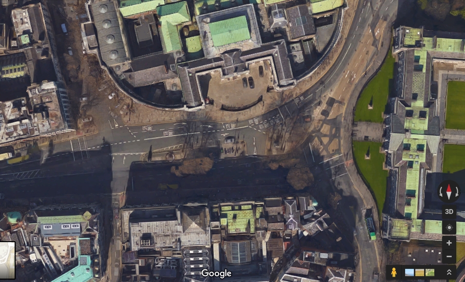
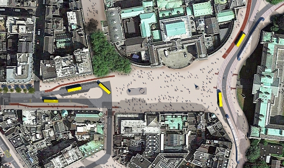
Apart from some opposition from taxi drivers and the bus company, most Dubliners, including our ECF's Irish partner cyclist.ie, welcomed the plan. Nevertheless, the new “car free” design of the square meets some interesting challenges. As part of the FLOW-project, the European Cyclists' Federation and Walk21 analyzed with the City of Dublin the traffic flows of cyclists and pedestrians. The number of cyclists in Dublin has increased enormously in recent years and College Green is an important junction in the bicycle network. Not only for cyclists directed to the nearby shops, restaurants and offices, but also for the ongoing bicycle traffic. And here comes the matter: around 10.000 cyclists daily will have to go across the flows of pedestrians, which are estimated around 100.000 daily.
Sharing the space?
The original plans were based on the idea of a shared space of coexistance for cyclists and pedestrians, since both have a strong ability of self-regulation. By foreseeing each other’s behavior, a very limited number of collisions may happen. Cyclists and pedestrians can go around each other in a very functional way. In the Dutch city of Den Bosch, cycling through the shopping streets is never forbidden, even in market days. Indeed on market days the self-regulation works perfectly where cyclists just step off their bikes and walk.
Nonetheless, this self-regulation works because cyclists can use alternative routes for the same destination. It would lead to a lot of frustration if ongoing cyclists in a hurry would have to share such crowded spaces with pedestrians. Even more importantly, it could be a major issue for visual impaired and blind people, who could be facing cyclists any moment. The combination of ongoing cyclists and lingering pedestrians is not very good as well, because their movements are unpredictable for cyclists.
Both Walk21 and ECF conclude that in these circumstances a proper readable, clear and recognizable dedicated cycle path is the better solution. Specifically for the well-being of the pedestrians, especially those who are visually impaired and those feeling unsure. Naturally some pedestrians will walk on the cycle path in such situations. Therefore, a clear readability of the cycle path can help to make a ringing cyclist understandable. A proper width will allow the cyclist weaving around them.

Crossing
There is one part of the square that needs special attention for the designers though. Since the main flows of pedestrians and cyclists are different and cross on the west side of the square, a natural solution would be to regulate them with traffic lights or through a zebra crossing. But both won’t work. Without motorized or vehicle traffic, respecting the red light or the zebra crossing would come unnatural, and both these solutions wouldn’t fit on a broad square. The only solution is to make a design that supports the self-regulation ability of pedestrians and cyclists. That means that if the aim of the design is clear, cyclists would slow down on this very spot and –most importantly- there would be enough width to make the weaving possible. This could be researched in a microscopic traffic model.
Ugly?
And what about the designers? Some will say that a segregated cycle path through the square would look ugly, claiming that a square with a one-colored floor of authentic stones is the only acceptable design. But wouldn’t it be logic to label them as “bad” designers, if they would sacrifice the usability and even the safety of the users for their own taste? It is like an architect who designs a beautiful building - in which you can’t find the entrance though.
Thus, designers of buildings, public spaces and streets should always have the user-friendly criteria in mind while planning!
Regions:
Network/Project Involved:
Contact the author
Recent news!
Upcoming events
Contact Us
Avenue des Arts, 7-8
Postal address: Rue de la Charité, 22
1210 Brussels, Belgium


